Input Types
The following provides a detailed description of each input type and its associated options.
- Number
- Text
- File
- Single Select
- Multiple Select
- Checkbox
- Slider
- Range Slider
- Color Picker
- Date Time
- Rich Text
Number Input
The NumberInput enables inputting a number as an integer or a float.
| Option | Description |
|---|---|
| Name | A unique variable name to be used in the Code step as input to the main function |
| Label | The label that describes what the input represents to the user |
| Conditional Input | A set of conditions that controls whether the input is invisible or disabled |
| Units | The units that would be displayed to the user. The units will be rendered in Latex/Katex |
| Default Value | The default value when the app is initally loaded without any changes from the user |
| Required | If checked, the app will not run unless the value is not empty. Otherwise, empty values are allowed |
| Disabled | If checked, this input will be greyed out and not editable. Otherwise, the input is editable |
| Read Only | If checked, this input will not editable. Differs from disabled in that it's not greyed out |
| Step | The precision by which the user can input a number, ie. the step size |
| Min | The minimum value that the user can input |
| Max | The maximum value that the user can input |
| Randomized | Randomize the default value to a random number within the min and max range, and with the step size. |
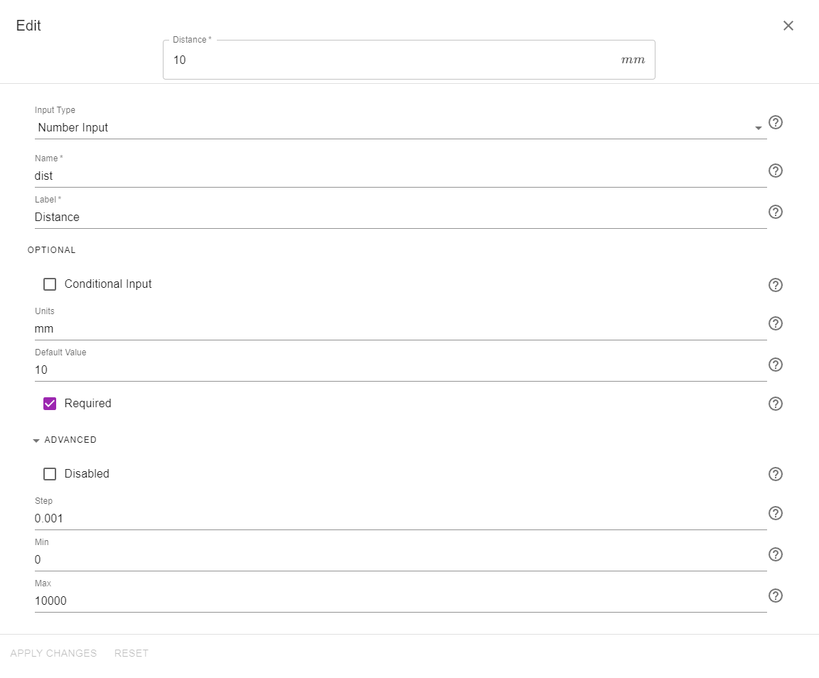
As an example, the following image displays an input group with one number input labelled: "Distance" with a default value of and a precision of . The minimum and maximum values allowed are 0 and 10,000. The variable name to be used in the Code step is dist.

Text Input
The TextInput enables inputting text to be available as a string in the Code step.
| Option | Description |
|---|---|
| Name | A unique variable name to be used in the Code step as input to the main function |
| Label | The label that describes what the input represents to the user |
| Conditional Input | A set of conditions that controls whether the input is invisible or disabled |
| Default Value | The default value when the app is initally loaded without any changes from the user |
| Placeholder | If the input is empty, the Placeholder is a message displayed to the user when editing the input. It should hint at a possible input |
| Required | If checked, the app will not run unless the value is not empty. Otherwise, empty values are allowed |
| Disabled | If checked, this input will be greyed out and not editable. Otherwise, the input is editable |
| Read Only | If checked, this input will not editable. Differs from disabled in that it's not greyed out |
| Min Length | The smallest number of characters that the user can input |
| Max Length | The largest number of characters that the user can input |
| Pattern | This is a sequence of characters that are used to validate the input against a specific pattern chosen by the developer. Pattern must be a regular expression (regex) string. For example, the developer can force the text input to contain letters without any numbers or special characters. For more information, consult with the HTML input pattern attributes and JavaScript Regular Expressions. The default value of .* allows any input containing spaces, special characters, letters, and numbers |
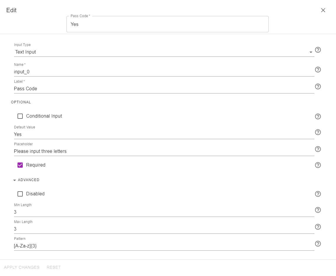
As an example, the following image displays an input group with one text input labelled: "Pass Code" with the default value "Yes" and a placeholder of "Please input three letters". The minimum and maximum lengths are set at 3. The variable name to be used in the Code step is input_0. The pattern allows only three upper case or lower case letters.

File Input
The FileInput allows the user to upload a file that can be read in the Code step as a base64 encoded string.
| Option | Description |
|---|---|
| Name | A unique variable name to be used in the Code step as input to the main function |
| Label | The label that describes what the input represents to the user |
| Conditional Input | A set of conditions that controls whether the input is invisible or disabled |
| Accept | Provide a filter to limit to only acceptable files in the file explorer. Accept can be one particular extension (e.g. .csv) or a group of extensions (e.g. .csv, .xlsx, .png). You can also limit to recognized file types, such as audio/*, video/*, or image/*. |
| Required | If checked, the app will not run unless the value is not empty. Otherwise, empty values are allowed |
| Multiple | If checked, the user can upload multiple files. Otherwise, only one file can be uploaded |
| Disabled | If checked, this input will be greyed out and not editable. Otherwise, the input is editable |
| Max size | Maximum file size in bytes. The default value is 100,000,000 bytes which is 100MB |
Please see the Working with Files section for more details about FileInput. Otherwise, you can start exploring how to work with files by choosing the "Files" template when creating a new app:

Single Select
Using the SingleSelect input, the developer provides a few options from which the user can select a single option from. The value chosen by the user is available as a string in the Code step.
| Option | Description |
|---|---|
| Name | A unique variable name to be used in the Code step as input to the main function |
| Label | The label that describes what the input represents to the user |
| Conditional Input | A set of conditions that controls whether the input is invisible or disabled |
| Options | The list of available options to choose from |
| Disabled | If checked, this input will be greyed out and not editable. Otherwise, the input is editable |
| Read Only | If checked, this input will not editable. Differs from disabled in that it's not greyed out |
Depending on the number of available options, the options will be displayed as either radio buttons, or as a dropdown menu.
The following example shows two SingleSelect inputs where Option 1 is chosen by default. The first input has three options, while the second input has five options.
Multiple Select
Using the MultipleSelect input, the developer provides a few options from which the user can select multiple options. The options chosen by the user are available as a list of strings in the Code step.
| Option | Description |
|---|---|
| Name | A unique variable name to be used in the Code step as input to the main function |
| Label | The label that describes what the input represents to the user |
| Conditional Input | A set of conditions that controls whether the input is invisible or disabled |
| Options | The list of available options to choose from |
| Required | If checked, the app will not run unless the user has selected at least one option |
| Disabled | If checked, this input will be greyed out and not editable. Otherwise, the input is editable |
| Read Only | If checked, this input will not editable. Differs from disabled in that it's not greyed out |
| Chip | If checked, the chosen options will be displayed as chips. Otherwise, they will be displayed as a comma separated list |
The following example shows two of three options selected for a Multiple Select input with Chip checked:
Checkbox
The Checkbox input is available in the Code step as a boolean variable with values of True if checked, and False if unchecked.
| Option | Description |
|---|---|
| Name | A unique variable name to be used in the Code step as input to the main function |
| Label | The label that describes what the input represents to the user |
| Conditional Input | A set of conditions that controls whether the input is invisible or disabled |
| Disabled | If checked, this input will be greyed out and not editable. Otherwise, the input is editable |
| Read Only | If checked, this input will not editable. Differs from disabled in that it's not greyed out |
| Default checked | If checked, this Checkbox input will be checked by default |
Slider
The Slider input allows the user to select a number within a range by sliding on a bar using the mouse. The developer specifies the minimum and maximum values in addition to the step. The Slider input is available as an integer or a float in the Code step depending on the step size.
| Option | Description |
|---|---|
| Name | A unique variable name to be used in the Code step as input to the main function |
| Label | The label that describes what the input represents to the user |
| Conditional Input | A set of conditions that controls whether the input is invisible or disabled |
| Default Value | The default value of the slider input. It must be within the range of min and max |
| Min | The value corresponding to the far left position of the slider |
| Max | The value corresponding to the far right position of the slider |
| Step | The precision (or step size) of the slider |
| Disabled | If checked, this input will be greyed out and not editable. Otherwise, the input is editable |
| Marks | If checked, tick marks separated by the step size will appear on the slider |
As an example, the image below shows a slider with tick marks which returns a value between 0 and 100 with a step size of 5.

Range Slider
The RangeSlider allows the user to input two numbers by sliding two ends of a bar using the mouse. The developer specifies the minimum and maximum values in addition to the step. The RangeSlider input is available as a list of two integer/float values in the Code step.
| Option | Description |
|---|---|
| Name | A unique variable name to be used in the Code step as input to the main function |
| Label | The label that describes what the input represents to the user |
| Conditional Input | A set of conditions that controls whether the input is invisible or disabled |
| Default min value | The default value of the first number in the returned list. This is the smaller value |
| Default max value | The default value of the second number in the returned list. This is the larger value |
| Min | The value corresponding to the far left position of the range slider |
| Max | The value corresponding to the far right position of the range slider |
| Step | The precision (or step size) of the range slider input |
| Disabled | If checked, this input will be greyed out and not editable. Otherwise, the input is editable |
| Marks | If checked, tick marks separated by the step size will appear on the slider |
As an example, the following image shows a range slider with tick marks that returns a list of two numbers between 0 and 100 with a step size of 5. The returned value of this range slider is [25,75].
Color Picker
The ColorPicker allows the user to pick a color from a color palette and is available in the Code step as a hex color code string.
| Option | Description |
|---|---|
| Name | A unique variable name to be used in the Code step as input to the main function |
| Label | The label that describes what the input represents to the user |
| Conditional Input | A set of conditions that controls whether the input is invisible or disabled |
| Default value | The default value in the color palette |
| Disabled | If checked, this input will be greyed out and not editable. Otherwise, the input is editable |
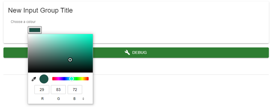
Below is an image showing the ColorPicker input type.

Date Time Picker
The DateTimePicker allows the user to pick a date and/or a time and is available in the Code step as a datetime string of the form yyyy-MM-dd'T'HH:mm:ss.SSS'Z', which is the corresponding Greenwich Mean time.
| Option | Description |
|---|---|
| Name | A unique variable name to be used in the Code step as input to the main function |
| Label | The label that describes what the input represents to the user |
| Conditional Input | A set of conditions that controls whether the input is invisible or disabled |
| Type | The developer specifies whether the user should input date and time, date only, or time only. If the user is required to input the date only, then the current time will be used and vice versa |
| Disabled | If checked, this input will be greyed out and not editable. Otherwise, the input is editable |
| Read Only | If checked, this input will not editable. Differs from disabled in that it's not greyed out |
Rich Text
The RichText editor allows the developer to add other visual elements to the user, such as formatted text, images, videos, formulas, hyperlinks, and many more. The text editor toolbar provides an array of icons that the developer can use to design a visually pleasing rich text entry.
| Option | Description |
|---|---|
| Conditional Input | A set of conditions that controls whether the input is invisible or disabled |
Additionally, mathematical formulas using katex can also be inputted by the developer using this syntax:
{{outputs.fx | katex}}
Use two backslashes "\" to represent one "" in the Katex expression.
For example, the following formula is used to display .
{{"x^2+\\frac{1}{x}" | katex}}
When editing an input, don't forget to click on APPLY CHANGES at the bottom of the screen to save your work